Timely enough, given the record temperatures we're experiencing this week. Tomorrow's forecast has been "upgraded" from what I reported yesterday: the THI may reach 117F tomorrow.
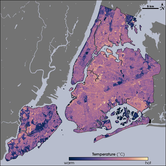
Temperatures in New York City as measured by Landsat on August 14, 2002, at 10:30am, during a heat wave. Cooler temperatures are blue, hotter are yellow.
Source:
NASA Earth Observatory. Map by Robert Simmon, using data from the Landsat Program.
Temperatures in New York City as measured by Landsat on August 14, 2002, at 10:30am, during a heat wave. Cooler temperatures are blue, hotter are yellow.
Source:
NASA Earth Observatory. Map by Robert Simmon, using data from the Landsat Program.
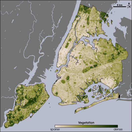
The ability of vegetation to moderate urban temperatures is graphically demonstrated in these paired images from NASA's Earth Observatory. The spatial resolution of these images is 60 meters per pixel. At that scale, I can just about make out the block where I garden:
Closeup of the vegetation map, centered on central Brooklyn. The green area at the left is Greenwood Cemetery. Prospect Park is the dark green area at the top; the white area within it is Prospect Lake.
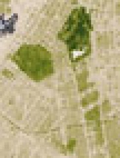
Below the park, to the south, Victorian Flatbush, with its tree-lined streets, detached wood frame houses, and front lawns, spreads out as a series of olive green areas. The beige areas in-between the olive are rowhouses and apartment buildings. You can even make out a curving green line across the southern end of this area: That's the old LIRR right-of-way, long abandoned, and overgrown with trees.
NASA has just published a report on urban heat islands highlighting the research of Stuart Gaffin, an associate research scientist with the Earth Institute at Columbia University in New York City, and his colleagues:
In the summer of 2002, Gaffin and his colleagues used satellite temperature data, city-wide land cover maps, and weather data, along with a regional climate model to identify the best strategies for cooling the city. The team estimated how much cooling the city could achieve by planting trees, replacing dark surfaces with lighter ones, and installing vegetation-covered “green roofs.”
The team studied the city as a whole, as well as six “hotspot” areas—including parts of Manhattan, the Bronx, Queens, and Brooklyn—where air temperatures near the ground were higher than the city-wide average. Each area was serviced by Con Edison, the local power company, so the scientists could compare electricity use. Each area also had available space so that the mitigation strategies the team considered could be modeled in the study and potentially implemented later on.
August 14 fell on one of the hottest heat wave days in New York’s summer of 2002, making it a good day to take the city’s temperature. Measuring the temperature of every last sidewalk, street, parking lot, roof, garden, and grassy area in an entire city isn’t easily done from the ground, so the researchers relied on NASA to take the city’s temperature from the sky. NASA’s Landsat Enhanced Thematic Mapper collected thermal infrared satellite data. ...
- Beating the Heat in the World's Big Cities
Related posts
Urban Forestry